

Last time I went onto Nintendo Shop, I needed to unsubscribe from their notifications because I really don’t need this kind of thing in my life.
Anyways. I went into my options for promotional emails and was a bit surprised by the user interface I found, especially on the checkboxes.
What is the issue encountered on Nintendo Shop?
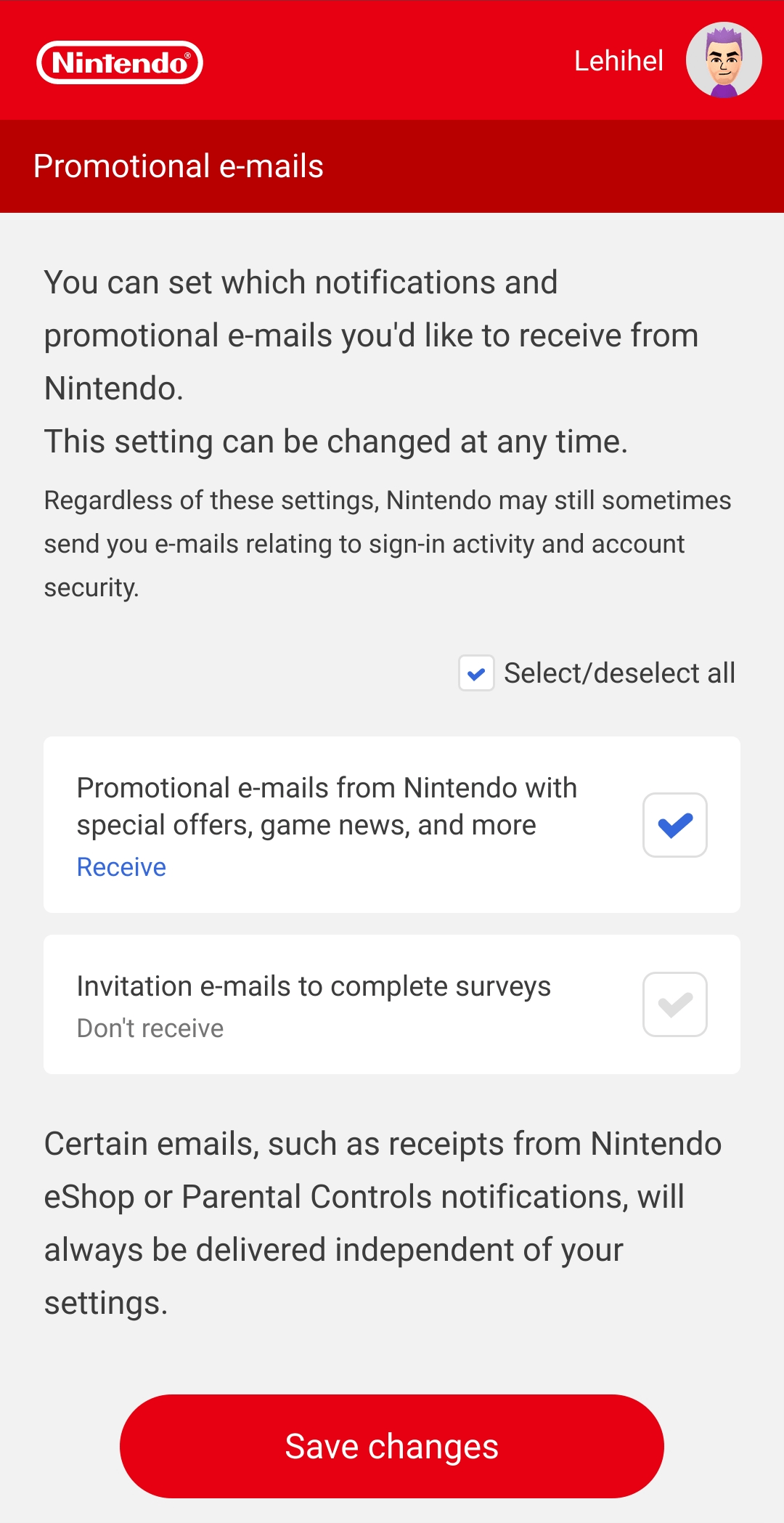
The visual aspect of these checkboxes were quite disturbing at first. I arrived on a page like this.

My first reaction was a bit like “Oh my god, these sons of b%`ù^$ checked everything by default and don't allow me to unchecked”, wouldn’t you?
Indeed, with this check mark inside the box, and those poorly contrasted colors, I thought that the checkboxes were disabled and checked by default.
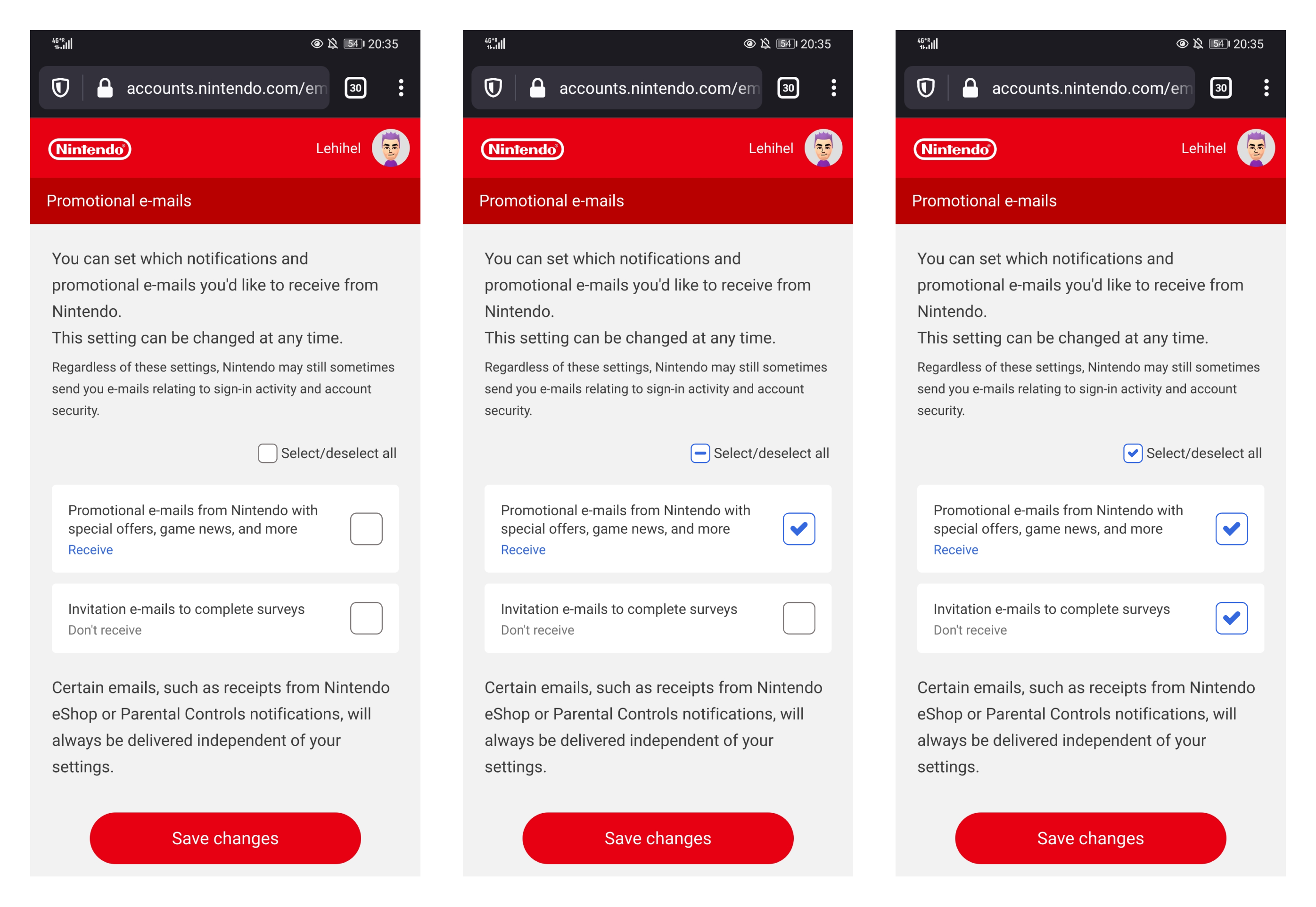
Then I tapped on one option…
Ok… what happened here?
The so called disabled state was in fact a simple not checked status. Well, this several issues in only one simple poor design proposition. Let me explain in some bullet points:
- UI/Usability: form control states are pretty much well known and documented, a disabled item has low contrasts, oftentime a gray light on white. A checked item has a symbol that suggest the check box is filled by something (cross, check mark, sometimes a square). Going too far from these defined codes leads to this kind of issue.
- Accessibility: The information is conveyed only by the color, which is a failure on criterion 1.4.1 of the WCAG. Indeed, the only thing that changes when I check the box is the check mark color. People who don’t perceive colors with enough precision won’t be able to get the change here.
- Cognitive load: Why are you displaying a Select/Unselect All check while there is 2 options available? (debatable for a future-proof component with a lot more options)
We can tackle this Nintendo Shop issue pretty easily.
What is the suggestion with this Nintendo Shop issue?
The action plan I propose is kind of simple:
- respect the “rules” on checkbox styles
- list and define the styles strickly
- take colorblind people into consideration
On the 2 first actions, here is what I propose in term of checkbox states.
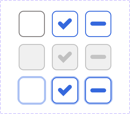
It includes several useful states you should always have at least in your component libraries:
- A normal state, contrasted enough,
- A checked state
- An undeterminate state
- For each of these: a disabled state
- For each of these: a focus state.
The "disabled" states have a clear low contrast unlike the activatable ones.
Here is the interface solution I propose:
Here is a quick video of this prototype, but I'm sure you get the idea 😊
In these screens, you clearly see the difference between a selected, not selected, and partial selection (thanks to the undeterminate state).
We offer a clear set of states, a change of color to respect the Nintendo brand, and we ensure that people with disabilities aren’t left behind.
Of course, this is only a visual suggestion among other ways to fix this.
Global learnings - Takeaways
With this example we brought back a bit of consistency in the habit we have at using form controls. There is absolutely no need to get fancy and original when it comes the time to design components for web forms. Keep it simple and learn from the native states of those components by watching interactions on non-styled checkboxes, for instance.
Some things we learned together with this case:
- Mental Model: Well, some elements on the web are pretty much defined since the web was borned. Stick to that code, people are used to it. Or, if you want to get original, be careful not to conflict with existing models.
- Accessibility: Never rely only on colors when you need to convey information or changes. This is not enough for a big part of the population with visual impairement.
- Cognitive overload: we didn’t illustrate this, but don’t put unnecessary component on the screen. Don’t overthink your screens. I really think that the “Select/Unselect All” option is simply too much unecessary information here.

